More useful UI/UX stuff on my Twitter:
@ascensus_mdbContent should be the star
Ok, we've got 2 hard truths about design behind us:
- Usability and functionality determine the sense of beauty in the UI
- UI design is a craft, not an art
Now it's time for the third, perhaps the most difficult truth to accept.
What does that mean exactly?
As UI designers, we must accept that our creations serve commercial purposes. What's more - what we create cannot function in the real world without content and the user who consumes this content.
UI design is not art for art's sake (and as we have already established - it is not art at all, but a craft).
Many, especially novice designers, think that if, for example, a client commissions us to design an interface for a financial application, their goal is to create such a beautiful design that will delight the user.
They are wrong.
What happens when design becomes more important than content?
To better illustrate this idea, let's use the example of this tutorial.
The content in this case is text, and it's mainly because of it (or more precisely, the knowledge you can gain thanks to it) that you visited this site.
Let's assume, however, that the current design does not satisfy my artistic nature and I feel the need to express myself more. For this reason:
- in the background of the page I will add a colorful pattern
- I will add shadows to the right and left columns
- I will add a bluish gradient to the sidebar with navigation on the left
- I will add colored backgrounds for the main title and for the key idea in the text
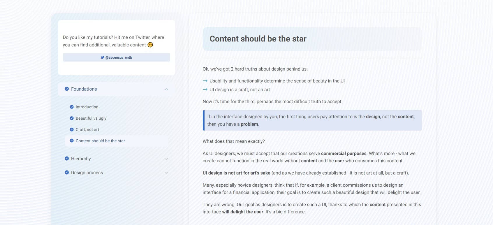
Okay, I'm artistically fulfilled and I'm sure you'll notice my design now.
However, in which case is the content, the main reason why you are here, more readable?
Which UI would you prefer to use?
Take another look at the design used in this tutorial. In accordance with the principles of Material Minimal, it's minimalist.
The design here is just a stage, which is supposed to allow the main actor - the content - to present itself in the best possible way.
The stage must not distract from the actors, because people do not come to the theater for the sake of the stage itself.
Of course, the stage is needed and creates the necessary conditions for the performance of a theatrical play.
However, if you overdo it with the design, it's like during a crucial moment, such as when the main actor professes his love for his beloved, on the background stage, you sets off fireworks, releases a giraffe and play loud music that drowns out everything else.
Don't go this way. Remember - it's the content should be the star.

About author
Michal Szymanski
Co Founder at MDBootstrap and Tailwind Elements / Listed in Forbes „30 under 30" / Open-source enthusiast / Dancer, nerd & book lover.
Author of hundreds of articles on programming, business, marketing and productivity. In the past, an educator working with troubled youth in orphanages and correctional facilities.