More useful UI/UX stuff on my Twitter:
@ascensus_mdbLess is more
An interface is like a joke. If you have to explain it, it's not that good
In the ever-evolving world of UI design, one principle continues to hold true: less is more. Simplicity is a critical aspect of effective design, as it contributes to a more streamlined, efficient, and satisfying user experience.

I suspect that you know this company, which is famous for its minimalist design and users who are so satisfied with its products that it borders on fanaticism 😉
Just as a good joke is immediately understood and appreciated without the need for explanation, an effective interface should be intuitive, allowing users to easily navigate and accomplish their goals without confusion.
Simplicity in UI design ensures that users can quickly grasp the functionality and layout of the interface, minimizing cognitive load (we will learn about this later) and reducing the chances of user frustration. By embracing simplicity and creating interfaces that require little to no explanation, we can deliver products that keeps users engaged and encourages them to come back.
Avoid over-designing
There is a great temptation, especially for novice designers, to make the UI complex
This is usually due to a seemingly reasonable approach. We simply want the interface designed by us to best address all user needs - both present and possible in the future.
And it just simply seems wrong to us to give away a project that looks like we didn't put too much effort into it. We want the client to appreciate the fullness of our abilities, so we feel compelled to present our skills in UI elements that are not necessarily needed.
This is why, even when creating a simple design like for a blog, many designers consider whether:
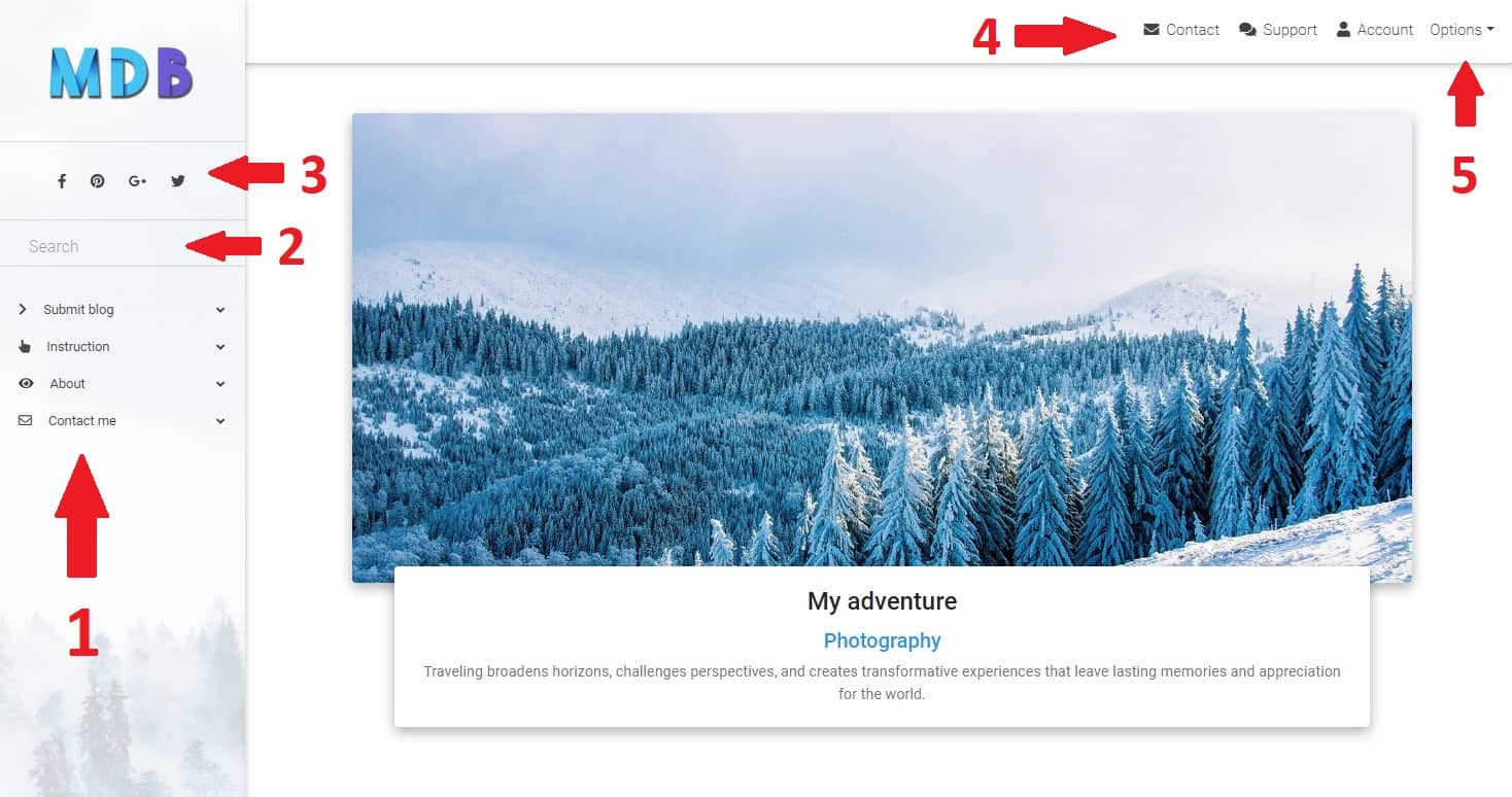
- Should I add sidenav in case the blog grows and advanced navigation is needed?
- The search box will probably come in handy when in the future there will be so much content that you will not be able to do without it
- Does the author of the blog run his own social media? Never mind, I'll add icons just in case
- Navbar is a necessity, so there is nothing to discuss here
- Maybe the author will want to introduce a login system, so in the navbar a dropdow with options for users will be useful
Once we fall down this rabbit hole, it's hard to get out, which makes the project more and more complicated.
Hmm, a small sidebar on the right with a list of the most interesting articles certainly won't hurt anyone....

As a result, you end up with an extremely complex interface in which many elements fight for the user's attention, making him not know what is most important and what to focus on.
This significantly increases the cognitive load we mentioned earlier.
To sum up - the more complex the interface, the more energy the user's mind needs to process it. And because this is an unpleasant task for the mind, it automatically classifies the given UI as ugly.
Do you remember? Beautiful = useful, functional, simple
Now let's turn to simplicity, and forget about navbars, sidebars, dropdowns and any other elements that are not crucial at the moment.
Content is king, and let it rule our UI undividedly.
So what happens when we focus entirely on text in design?
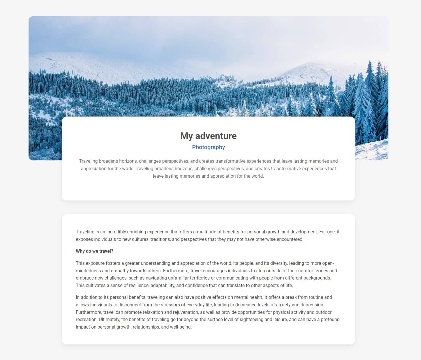
Huh, I don't know about you, but I think it looks much much better.
This brings us to the final conclusion of this lesson - Occam's Razor in design
Occam's Razor is a principle that states that the simplest solution is often the best one. In UI design, this means that we should strive to create interfaces that are as simple and intuitive as possible.
This can be achieved by eliminating unnecessary elements and focusing on the core functionality of the design. When applying Occam's Razor, we should ask ourselves whether each element on the screen is necessary and if it is contributing to the user's understanding of the interface.
If you have several options to choose from and are wondering which one to use, remember: Simple is (almost) always the best choice

About author
Michal Szymanski
Co Founder at MDBootstrap and Tailwind Elements / Listed in Forbes „30 under 30" / Open-source enthusiast / Dancer, nerd & book lover.
Author of hundreds of articles on programming, business, marketing and productivity. In the past, an educator working with troubled youth in orphanages and correctional facilities.