More useful UI/UX stuff on my Twitter:
@ascensus_mdbUI design is a craft, not an art
In the previous lesson, I tried to convince you of the old truth of aesthetics, namely that people consider beautiful what is good and useful.
Now it's time for the second truth, which raises much more resistance, especially among those more sensitive designers.
UI design is not an art and should not aspire to become one. Too "artistic" approach to interface design is harmful and most often makes the product incomprehensible and hard to use.
The world of User Interface design is often surrounded by misconceptions, with many believing it to be solely a realm of art and creativity. However, the process of designing and developing effective, user-friendly interfaces goes far beyond mere aesthetics.
In fact, UI development is a craft that requires the harmonious combination of technical skills, psychological understanding, and attention to detail.
And what is even harder to accept for these more artistic minded designers - UI design requires planning, constraints and sticking to the rules.

UI design cannot be treated as art because its primary purpose is to create a functional, practical product that facilitates efficient interaction between users and applications.
Unlike art, which primarily aims to evoke emotions and convey a message or story, UI design focuses on solving problems, improving usability, and meeting users' needs.
A successful UI design should be intuitive, easy to navigate, and accessible to a wide range of users, taking into account real-world constraints and platform limitations. Therefore, UI design must prioritize practicality and functionality over artistic expression to ensure that it serves its intended purpose and delivers a satisfying user experience.
So don't be an artist, be a craftsman
Don't get me wrong, it's not that I have anything against an artistic approach in general. But do you think that good art is literal, simple and clear?
No, on the contrary. Good art is usually ambiguous, evoking strong emotions, not giving ready answers.
These are the qualities that give art depth and value, but when used in UI design, they can result in a product that does not meet functional and practical requirements.
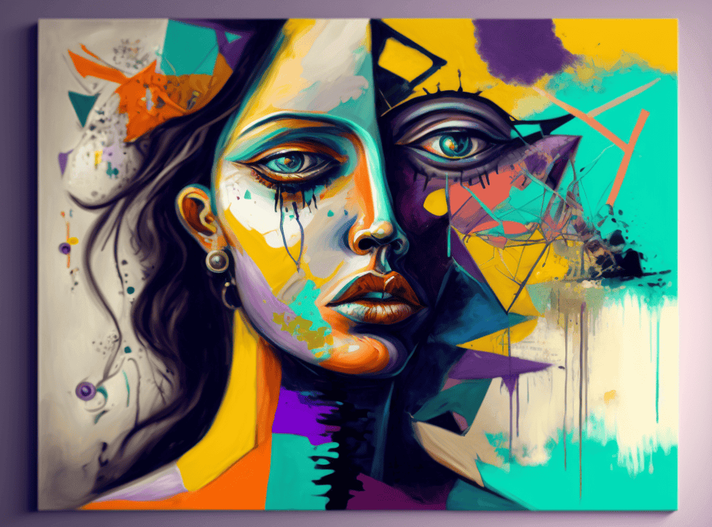
The Dribbble Dilemma: beautiful but impractical designs
Let me show you examples where artistic approach has adversely affected UI designs.
Dribbble, a popular platform for showcasing creative work, provides numerous examples of stunning UI designs that fail to prioritize functionality and practicality. While these projects may be visually impressive, they often overlook essential aspects of usability, navigation, and real-world implementation.
Sacrificing usability for aesthetics
Some Dribbble projects prioritize visual appeal to the point that usability suffers. These designs may feature unconventional navigation, unclear icons, or overly complex interactions that may be aesthetically pleasing but ultimately hinder the user experience. Such designs fail to serve the primary purpose of a UI – to facilitate efficient and enjoyable interaction between the user and the application.
Let's take one very typical dribbble example - line charts.
It's virtually impossible to find a dashboard design on dribbble.com that doesn't show data in line charts as rounded lines.
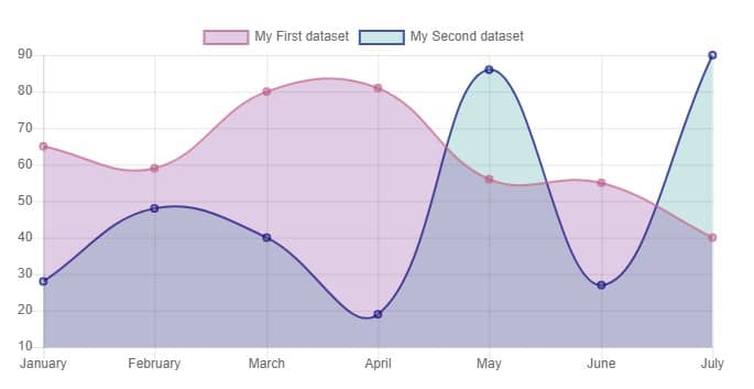
This type of data visualization can give the analyst a heart attack.
Why?
Rounded lines should not be used in line charts because they can introduce visual inaccuracies and misrepresent the underlying data.
Line charts are primarily designed to convey trends and patterns within a dataset, and using rounded lines may inadvertently create the impression of smooth transitions between data points, even when such transitions do not exist.
This can lead to false interpretations and hinder the viewer's ability to discern the true nature of the data being presented. In order to maintain the integrity of the information and promote accurate analysis, it is crucial to use straight lines that connect data points directly, thus preserving the fidelity of the data and its relationships.
Sounds reasonable?
- Typical dribbble designer
Sometimes it can go to the extreme. Have a look at the image below.
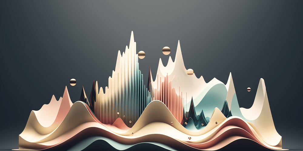
Yes, these are charts in artistic visualization a'la dribbble.
However, changing the approach from artistic to craftsmanship does not mean giving up aesthetics. Quite the opposite! However, it is crucial to remember what is the priority and it should always be functionality and pragmatism.
The thought I would like you to take away from this lesson is simple - be a craftsman, not an artist.

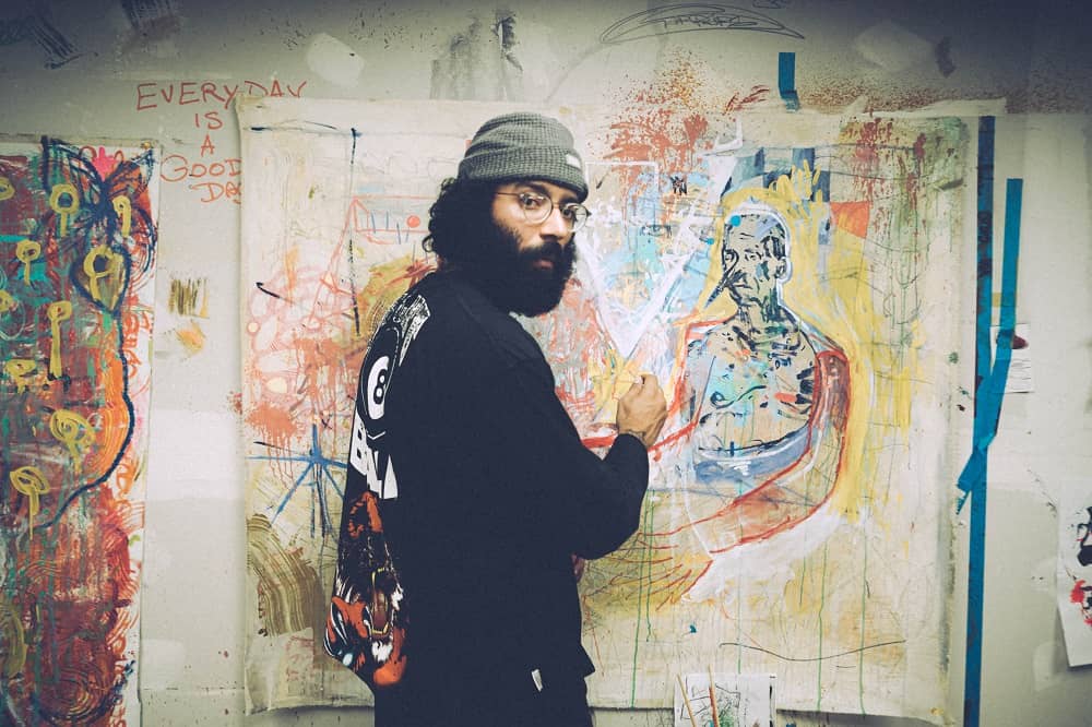
About author
Michal Szymanski
Co Founder at MDBootstrap and Tailwind Elements / Listed in Forbes „30 under 30" / Open-source enthusiast / Dancer, nerd & book lover.
Author of hundreds of articles on programming, business, marketing and productivity. In the past, an educator working with troubled youth in orphanages and correctional facilities.